Jasper Johns: An Allegory of Painting, 1955 - 1965
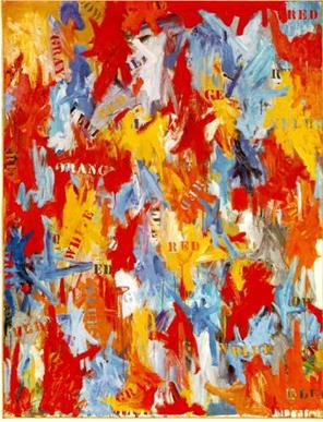
Jasper Johns, False Start, 1959
The Washington City Paper • February 2, 2007
By Jeffry Cudlin
To the uninitiated, Jasper Johns might sound pretty inartistic. This is the man who once said, “A picture ought to be looked at the same way you look at a radiator” and boiled down his process to three simple directives: “Take an object/Do something to it/Do something else to it.” He could make the occasional outré gesture like taking a bite out of one of his works and leaving visible teeth marks—something he did in 1961’s “Painting Bitten by a Man.” But in general we’re talking about someone whose favorite color—based on the available evidence—is gray.
This kind of grim, materialistic outlook was revolutionary in the fall of 1954. That’s when Johns decided to destroy all of his unsold older paintings and start over, making new works with encaustic, a quick-drying mix of wax and oil pigment. In his new works, he created rich, sculptural surfaces one isolated stroke at a time. Paradoxically, though, he used these textured strokes to paint images of flat, iconic subjects—flags, targets, numbers.
His work in the 10 years that followed was full of such paradoxes, and the decade proved to be Johns’ richest period of discovery and invention. In the National Gallery of Art’s current survey, curator Jeffrey Weiss groups Johns’ works into four categories: targets, names of colors, compasslike devices, and imprints of the body. Each category gets its own room, though there’s some overlap. Johns used these motifs to straddle the line between abstraction and representation—and in the process dismantle assumptions about what painting was and how it worked.
Targets weren’t unique to Johns; Washington Color School painter Kenneth Noland started painting them around 1956. But Noland’s targets were quasi-improvisational, colorful, and had resolutely flat surfaces. By contrast, Johns’ “Target With Four Faces” (1955) looks like a thick, waxy slab—more like sculpture than painting. Its lower part features a yellow and blue target set against a red background, and its concentric rings have clearly been drawn with a compass, not freehand, the way Noland typically executed his circles. The effect is comparatively cool and anti-expressionist. Above the target Johns added a strange sculptural addendum: A row of four plaster casts of a human face, each with its top cut off at the bridge of the nose and sitting in its own wooden compartment. The faces are comic in their crude, orange-painted finish, yet their eyelessness is unnerving. The target might be a surrogate eye, or an emblem of their powerlessness, as if these were men blindfolded before an execution.
Clement Greenberg, the influential critic who touted Noland’s work, tried to cast Johns as a throwback, a late adherent to what he called “descriptive painterliness.” For Greenberg, art was a search for aesthetic purity, and by straddling the line between abstraction and representation, Johns was muddying things up. But Johns’ work, as thorny and willfully problematic as it was, signaled a beginning, not a backward slide. Target With Four Faces isn’t simply an exercise in cool—in fact, Johns’ method could be downright sumptuous. The encaustic surface is not pasty but softly translucent; aging amber-colored newspaper clippings lie suspended beneath the surface, and teasing bits of text from those clippings peek out here and there—“History and Biography,” one headline proclaims. In a larger sister piece, “Target With Plaster Casts” (1955), the word “nation” ominously pops out. “your dreams…nearby!” proclaims a snippet buried in a 1961 Target. The silk-screened news headlines in “According to What” (1964) refer to the Kremlin.
The question of how much to read into these clippings is a tricky one. In much the same way that Johns’ work sits between abstraction and representation, it’s also positioned between seeing and reading—not exclusively inhabiting either pole. “Gray Target” (1958) seems to vibrate from edge to edge with scratchy bundles of apostrophes; his target drawings on paper from the same year look like tangles of messy cursive mixed with blocky capital letters. The works recall the graffitilike scrawl that Cy Twombly used in his blackboard paintings—though for Johns, these marks are not an end unto themselves. They cling to the faint outlines of each ring in the target, here defining an edge with opposed masses of dark and light, there blurring or eradicating the forms.
Johns soon went from making marks that looked like words to actually spelling things out. “False Start” (1959) is all oil paint, with none of the thick, choppy strokes of encaustic used in his targets. The paint film is surprisingly juicy; greasy dollops, marbled smears, and thin, broken washes of color combine to give the appearance of what could be standard modern fare—a speckled, decorative confection—except that Johns has stenciled the names of his colors onto each expressionistic blotch using blocky, utilitarian lettering.
Pointedly, almost none of the colors in False Start match the names to which they’re attached. This could be the impact of dada on Johns, who was particularly influenced at this time by Marcel Duchamp. (In 1958, Johns received a copy of Duchamp’s miniature museum, Box in a Valise, as a gift from a collector.) Much of the punning and nonsense poetry of dada had to do with distaste for the way powerful men and media outlets distorted language during World War I, detaching it from reality and reason. It’s not surprising that Johns, working during the heart of the Cold War, would be skeptical of linguistic signs, too.
The title of the show, “An Allegory of Painting,” hints at another aspect of Johns’ thinking. In contemporary art circles, “allegory” is usually code for “lack of authenticity”—for using broad categories or stereotypes to explain a subject instead of using specific instances. Johns is interested in the idea of words, not their specific meanings, or the idea of making an image, not simply the act itself.
When Johns covers one color with another, it occasionally looks like the sort of painterly effect one might find in any loose but polite abstraction. But repetition for Johns is a sort of effacement in which he replaces a spontaneous gesture with a premeditated one—usually in a less vibrant color. In “Land’s End” (1963), a clump of blue horizontal marks in the upper left-hand corner is covered, stroke for stroke, with black ones; a patch of yellow at the upper right is covered with a corresponding gray shape. This sort of cancellation is echoed in Johns’ habit of making studies not in preparation for his paintings but after the painting is done—sometimes years after the original works were executed. One of Johns’ studies for “Target With Four Faces,” for example, was actually produced by tracing a reproduction of the finished painting from the cover of ArtNews.
“By the Sea” (1961) is the high-water mark of Johns’ use of stencils in his layering process. All his colors are broken up, sullied or covered over with liberal amounts of his trademark gray paint. Many of the letters read as absences; paint has been built up around their contours, leaving letter-shaped windows onto layers of color underneath. Johns shows himself to be the reticent master covering over his tracks and leaving puzzles in his wake. On the bottom fourth of the picture, he superimposes the names of all three primary colors on top of one another; the “e” in blue elsewhere on the canvas has been clumsily restated in drippy black paint.
“Good Time Charley” (1961) shows the emergence of Johns’ use of implements: in this case, a ruler that has been attached directly to the canvas, leveling a swath of the surface. Johns built up a textured bed of gray pigment, then scraped the ruler across the painting, tracing an arc. At first this seems to be a pairing of opposites—a surface of expressive marks versus one that’s been smoothed into something flat and uniform. But Johns identified both types of painting with his body’s movements: Two years later, in “Periscope (Hart Crane)” (1963), he placed the imprint of his hand and the smear of his arm inside this leveled arc of pigment. This is Johns playing with the idea of the art object as simply a material trace of the body’s action, a sort of residue.
The logical conclusion of this reasoning can be found in his skin drawings, where he pressed his face and hands on sheets of paper, then used charcoal to pass over the stains that his skin’s natural oils had left, leaving a visible, tangible record of his actions. They seem purely like records of contact—yet once again, text enters the piece, as in “Skin With O’Hara Poem” (1963-65), where poetry by Frank O’Hara has been set in the margins of the page.
Johns was seldom doing just one thing, and the greatest-hits room at the end of the exhibition features large, later works in which Johns recaps all of the lessons he’s learned over the course of his momentous decade. “Field Painting” (1963-64), for instance, is a sampler platter of all his tricks, with its gaudy, lit-red-neon “R,” freestanding sculptural letters, and collaged household implements. Johns eventually moved on— thankfully he hasn’t kept mining the same territory over the decades. But arguably nothing he did after the mid-’60s would match the intellectual crackle of the years encompassed in this show.
If something is missing in the story that “An Allegory of Painting” tells, it’s Robert Rauschenberg, Johns’ artistic co-conspirator. The two once shared low-rent studios in the same building on Pearl Street in lower Manhattan, both appropriated castoff objects, and both doubled expressive brush marks in a repudiation of the ab-exers’ belief in spontaneity. (Their connection was so vital that many correlate Johns’ more dour work in the early ’60s to their split in 1961.) But Rauschenberg’s work was decidedly promiscuous—a joyous, uncensored mishmash of whatever crossed his path, from ruined bedding to stuffed chickens and goats. Johns was always more methodical, cautious, and reserved. In Calvin Tomkins’ book The Bride and the Bachelors, John Cage shares an anecdote about the two artists moving into new digs on Front Street: “Bob’s attitude was that if any of his work was damaged en route it wouldn’t concern him at all….Jasper’s attitude was that if something happened to one of his paintings he would have to work on it—not just repair the damage, but work on the whole painting, since any change would reopen the aesthetic problem for him.”
Rauschenberg’s work is rambunctious and, in many ways, easier to love. Johns, despite the quiet, ironic humor in his work, treaded more deliberately, focusing on key problems and contradictions of being an artist. His methodical gray hatchings, his persistent second-guessing and fence-straddling led the way for a new generation of artists to derail modern art, ending its trajectory toward ever more purified expression. What might have seemed quiet or dumbly literal turns out to be on fire, alive with ideas and portents.
next | previous | main menu